Thursday, April 28, 2011
4/28/11
finally my helmet is complete. I rendered it using the hdr image but for some image my plane didn't load correctly. however the result was i got a cool reflecting effect on the ground at it looks pretty close to being real.
Friday, April 22, 2011
4/22/11
finally the helmet is pretty muich complete. i have worked a while on it and it finally came together, that is what happens when the tutorials are confusing. my helmet looked okay but at my house my terrain models didn't come out as i suspected
Wednesday, April 20, 2011
4/20/11
finally my mask is looking like it should. The tutorial was very confusing and i had no idea what to do but with a little clarification it was easy. Now i can start working on my nature scene at my house using video tutorials, which i prefer over written.
Monday, April 18, 2011
4/18/11
finally i can perfect my helmet and the unclear tutorial can finally get a good helmet. i was
thinking about just completeing it at my house but it would wake forever. Using lynda.com though there is a few cook tutorials that i am going to try at my house.
thinking about just completeing it at my house but it would wake forever. Using lynda.com though there is a few cook tutorials that i am going to try at my house.
Thursday, April 14, 2011
4/14/11
today was again just another day of following the mask tutorial. Therre was many errors in the process and the mouthpiece took forever to model into the correct position. I wish the tutorial people could have given us numbers for anlges and movement so that the mask would turn out exact.
Tuesday, April 12, 2011
4/12/11
Today was a pretty broing day. we were doing one project/ tutorial the whole period long. it isn't that making the helmet wont be useful for my skills but i dont feel like i am learning a whole lot from it, besides being able to work with images.
Friday, April 8, 2011
4//8/11
the lady at the assembly was suprisingly interesting compared to the other two speakers i saw. Her story was pretty moving but since i am not a girl i cannot really relate or apply what i learned. but atleast i can promise not to be on the other end
Wednesday, April 6, 2011
4/6/11
today was finally a day about texturing. i have finally learned small piece of the vast textruing world. i don't know why i want to know how to texture so bad but picture a video game without texture. it would be really really dull so texturing plays a big part in 3D animation.
Monday, April 4, 2011
4/4/11
Didn't really do much today. at the beginning of the period I was just messing around with maya and then I recalled a tutorial book I was reading at home. I was using maya to fix pivot points on a wagon they provided. so I decided to make a red wagon. I just wish that I could transfer it to my house and work on it there.
Friday, April 1, 2011
my 5 best final abstracts
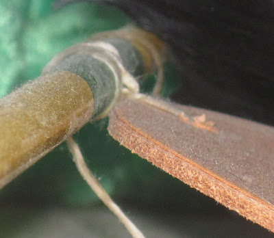
The arrow, instead of being a dead on shot, was placed in the top right which adds more visual interest and makes it abstract
Applying the compositional rules to random objects gives the object something it usually would not have, interest. The reason it does this is because the way the picture is taken it uses the same things that beautiful pictures have. My favorite out of my 5 best is my fan light. I would pass by day by day thinking of it as just a light switch but when I zoomed and took a picture of it it looked appealing. It took the boring old lamp switch and turned into a type of art.
this arrow displays the compositional rules because from the angle it was taken from fits the rules but you also cant get a clear picture of what it is.
suprisingly this is a doorknob to my front door, the way it was taken puts it in an interesting spot of the screen and gives it more appeal.
this is clearly nothing more than a branch but since it is placed on t of the third lines described in the article it adds more interest instead of it just being dead in the middle.
Subscribe to:
Comments (Atom)


